As long as you write code in XAML, I bet you must have used Grid in various ways. I wonder if you have seen any strange layout results of Grid.
I’ll talk about the undefined behaviors of Grid layout in this post. I call them the bugs.
This post is written in multiple languages. Please select yours:
Reading Tips: All of the examples described in this article are not common usages for Grid. (Microsoft is a great company. It will never do strange things on common situation.)
Star Unit on Infinite space
Copy and paste the code below and run to view the result:
1
2
3
4
5
6
7
8
9
10
11
12
<Canvas>
    <Grid Height="100">
        <Grid.ColumnDefinitions>
            <ColumnDefinition Width="100" />
            <ColumnDefinition Width="*" />
            <ColumnDefinition Width="2*" />
        </Grid.ColumnDefinitions>
        <Border Grid.Column="0" Background="CornflowerBlue" Width="150" />
        <Border Grid.Column="1" Background="Tomato" Width="150" />
        <Border Grid.Column="2" Background="Teal" Width="150" />
    </Grid>
</Canvas>
The 1st column is 100-pixel fixed-width. The 2nd column is *, and the 3rd one is 2*. Then what’s the visible width of the 2nd Border and the 3rd Border?
Press
F5
in
Visual
Studio
to
view
the
result
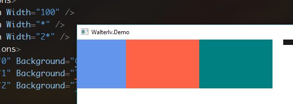
Did you predicate the result? Although the 2nd and the 3rd column width proportion is 1:2, the final visible proportion is 1:1.
There are flaws here, because you may suspect that the 3rd column is already twice as much as the 2nd column, but the right side is blank and cannot be seen. So now, we remove the Canvas and use HorizontalAlignment="Right". The new code is shown below:
1
2
3
4
5
6
7
8
9
10
<Grid HorizontalAlignment="Right">
    <Grid.ColumnDefinitions>
        <ColumnDefinition Width="100" />
        <ColumnDefinition Width="*" />
        <ColumnDefinition Width="2*" />
    </Grid.ColumnDefinitions>
    <Border Grid.Column="0" Background="CornflowerBlue" Width="150" />
    <Border Grid.Column="1" Background="Tomato" Width="150" />
    <Border Grid.Column="2" Background="Teal" Width="150" />
</Grid>
After running, you will find that there is no white space on the far right, that is to say, the 2nd and 3rd columns do not have a 1:2 ratio - they are equal.

So where is the lost space? Let’s resize the window to check it.
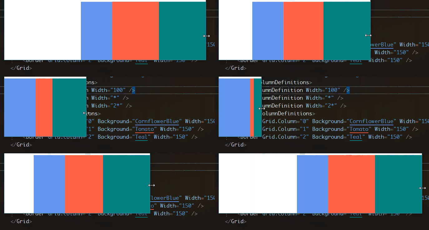
Even if there is space left on the left, the right side begins to clip the element space! Can we say that the length of a missing * length has gone to the left? Obviously not. However, we can guess that the clipping of the right side of the element begins at the 1:2 ratio.
Star Unit at the Size Just Required
HorizontalAlignment="True" helps us a lot to distinguish whether the right side really occupies space. So we continue the testing on the right-alignment.
Now, we modify the 2nd column Border to span the 2nd and 3rd columns. The 3rd column Border is placed into the 2nd column. (In other words, our 3rd column does not contain any Border.)
1
2
3
4
5
6
7
8
9
10
<Grid HorizontalAlignment="Right">
    <Grid.ColumnDefinitions>
        <ColumnDefinition Width="100" />
        <ColumnDefinition Width="*" />
        <ColumnDefinition Width="2*" />
    </Grid.ColumnDefinitions>
    <Border Grid.Column="0" Background="CornflowerBlue" Width="150" />
    <Border Grid.Column="1" Grid.ColumnSpan="2" Background="Tomato" Width="150" />
    <Border Grid.Column="1" Background="Teal" Width="150" />
</Grid>
The new behavior did not show much surprise to us because we have seen the behavior last section. The 3rd column disappeared, and the 2nd column still lost the 1:2 ratio.

Narrow the window again.
Narrow
the window
again
to
view
the behavior
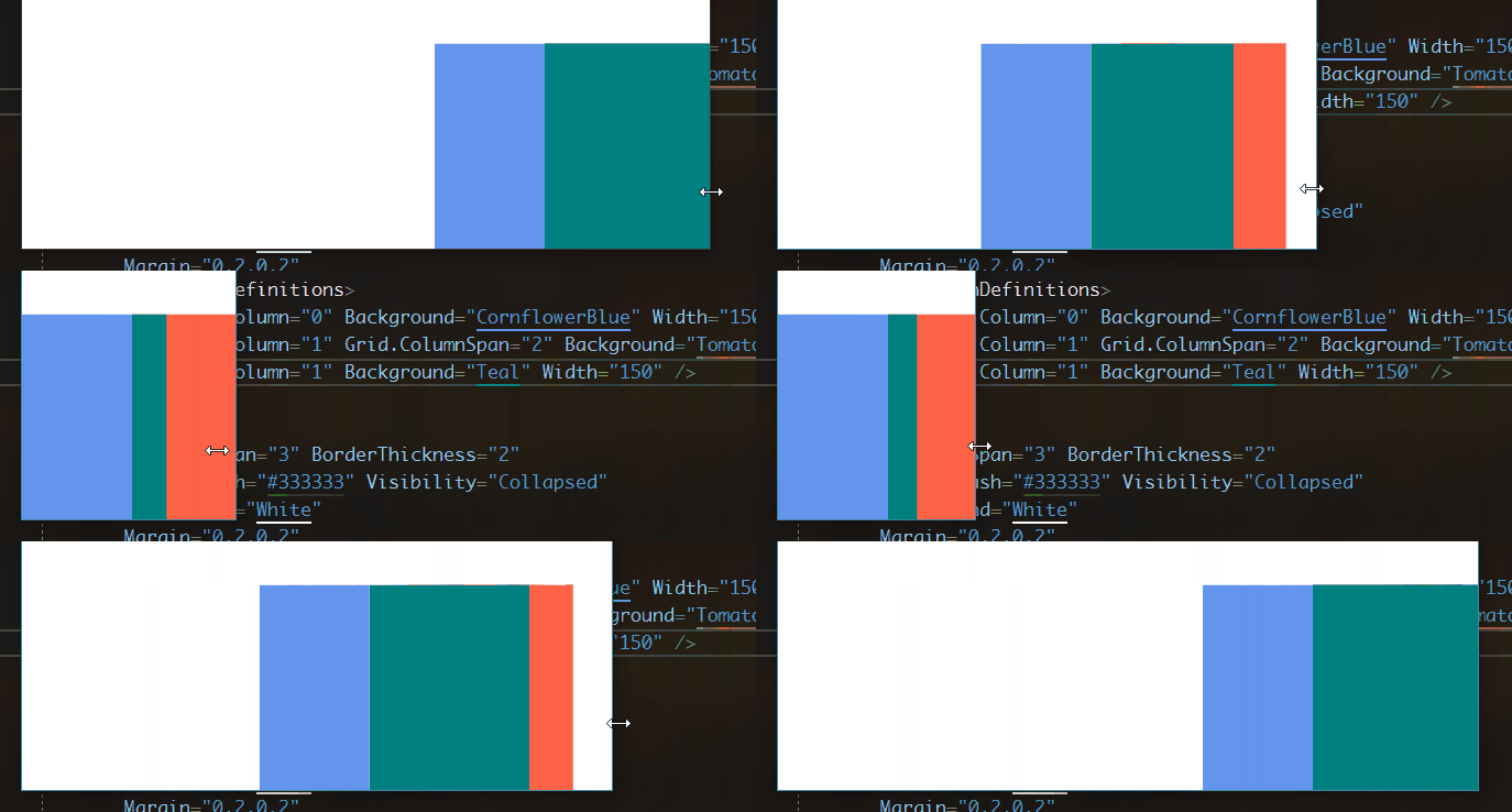
Why did the tomato Border suddenly appear when the window was narrowing? Why is there a blank space on the right side of the tomato Border?
If we have realized in the last post section that the right-side space is lost when it is right-aligned, why does the white space appear suddenly in the right-side again?
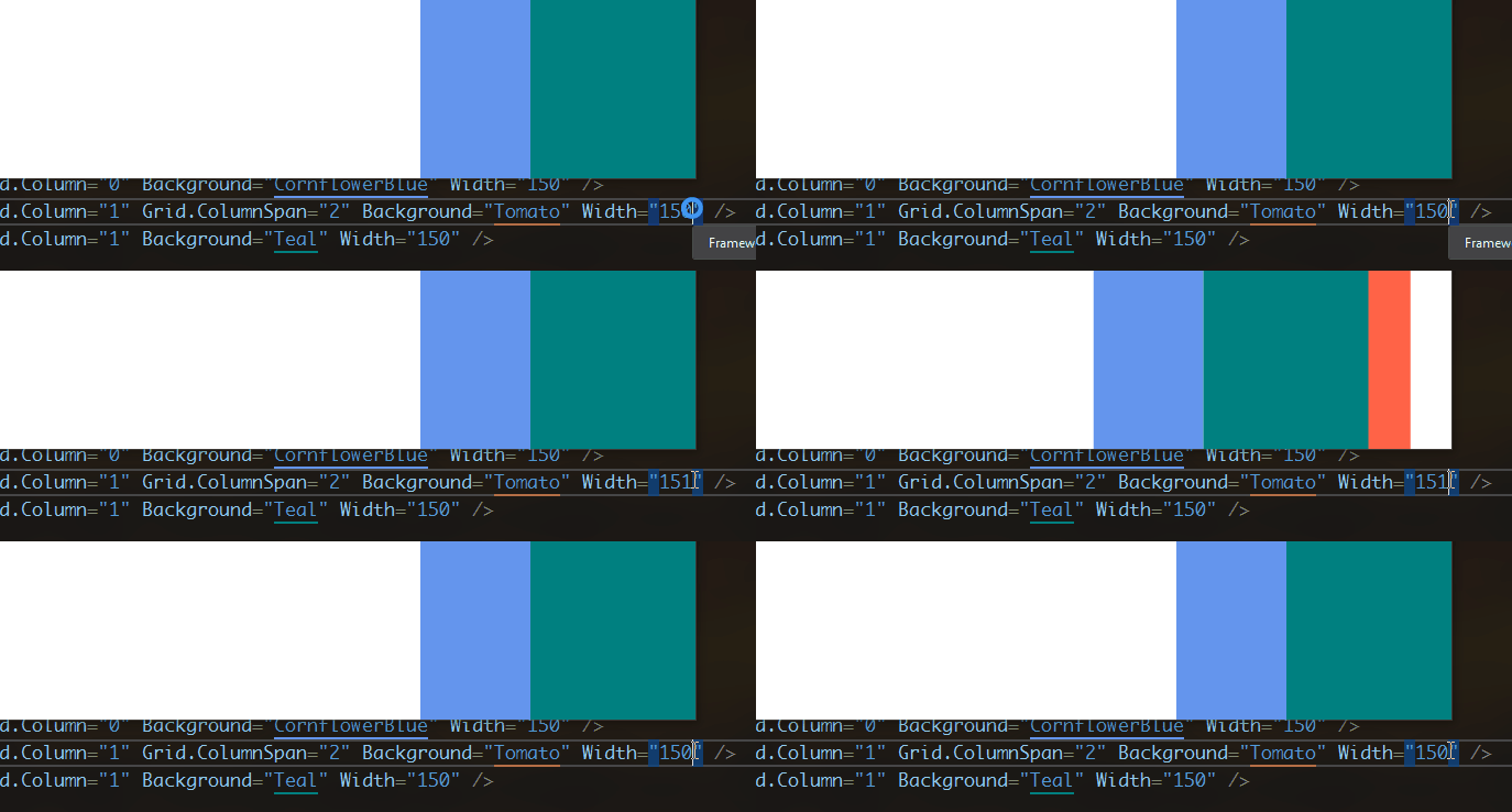
I tried to slightly increase the width of the second Border. Suddenly, I reproduced the strange behavior that I reproduced just now when resizing the window!
The Proportion of Auto Size
Now, abandon the previous right-aligned test method and no longer use the * width to separate the Grid. We use Auto instead.
1
2
3
4
5
6
7
8
9
10
11
<Grid>
    <Grid.ColumnDefinitions>
        <ColumnDefinition Width="Auto" />
        <ColumnDefinition Width="Auto" />
        <ColumnDefinition Width="Auto" />
    </Grid.ColumnDefinitions>
    <Border Width="159" Grid.ColumnSpan="3" HorizontalAlignment="Center" Background="PaleGreen" />
    <Border Width="28" HorizontalAlignment="Left" Background="#7FFF6347" />
    <Border Width="51" Grid.Column="1" HorizontalAlignment="Center" Background="#7FC71585" />
    <Border Width="28" Grid.Column="2" HorizontalAlignment="Right" Background="#7F008080" />
</Grid>
Specifically, we have four Border, placed in three columns of Auto size. The first Border spans three columns, and its size is longer than all the others, reaching 159. The remaining three Border each occupy a column, with two sides of equal length and a slightly longer middle.
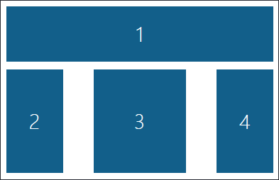
How are the columns in the actual layout divided? Here is the column width that the designer shows for us:

Where do 46, 69, 46 come from? Could it be that the proportion of 46:69 is the same as that of 28:51? However, the actual calculation result is not!
What if this is a calculation error?
So let’s look at the other two sets of values for the three Border: 50:50:50 and 25:50:25.

▲ 50:50:50

▲ 25:50:25
In 50:50:50, we eventually get the 1:1:1 proportion. But the ratio of column widths in 25:50:25 is far from 1:2:1. That is, in fact, the Grid does not calculate the column widths by the proportion to the size of the element.
The same Element Size but Different Column Width
In the experiment in the previous section, we notice that the same size brought about the same final visible size regardless of the proportion. However, this conclusion still can be subverted.
Now, we will replace 3 columns with 4 columns, and the number of Border will be replaced with 6.
1
2
3
4
5
6
7
8
9
10
11
12
13
14
<Grid>
    <Grid.ColumnDefinitions>
        <ColumnDefinition Width="Auto" />
        <ColumnDefinition Width="Auto" />
        <ColumnDefinition Width="Auto" />
        <ColumnDefinition Width="Auto" />
    </Grid.ColumnDefinitions>
    <Border Width="159" Grid.ColumnSpan="3" HorizontalAlignment="Center" Background="PaleGreen" />
    <Border Width="159" Grid.Column="1" Grid.ColumnSpan="3" HorizontalAlignment="Center" Background="PaleGreen" />
    <Border Width="28" HorizontalAlignment="Left" Background="#7FFF6347" />
    <Border Width="51" Grid.Column="1" HorizontalAlignment="Center" Background="#7FC71585" />
    <Border Width="51" Grid.Column="2" HorizontalAlignment="Center" Background="#7FC71585" />
    <Border Width="28" Grid.Column="3" HorizontalAlignment="Right" Background="#7F008080" />
</Grid>
Specifically, the first Border spans the first three columns, and the second Border spans the last three columns, the same length as the long Border of the previous section. The third and sixth Borders are on two sides and are as short as the previous Border. The middle two Borders are as long as the previous Border. Just like the picture that is shown below.
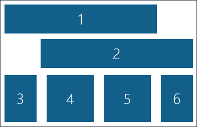
What is the width of the columns laid out at this time?

▲ 32:65:65:39
Wait! Where did the 39 come from? If the equal-size Border in the previous section would get equal-sized column widths, then this will also subvert! In fact, even if the proportion of the column width to the proportion of elements is the same at this time, there are as infinitely as many solutions under this layout. WPF picks only one out of this infinite number of solutions - and it cannot explain itself!
The conclusion of the Grid undefined behavior
In summary, the Grid layout has some unreasonable behaviors under special circumstances. I call them “the undefined behaviors”. These undefined behaviors are summarized in the following three points:
- Infinite layout space with * unit size
*unit column/row with multiple-span elements- Auto size in all column/row
However, you may think that I use the Grid in incorrect ways. However, as an API that exposes the behaviors, the behavior itself is also a part of the API. It should have clear traceable and documentable behavior instead of being explored and guess and failed by the user.
Microsoft does not have any official documents that disclose these bizarre behaviors, and I have not found such behavior in any third-party references (this post is my own conclusion). I think that Microsoft did not publish this kind of documents because the behaviors are too bizarre to be documented!
You may also be skeptical that I can go to Reference Source to check the source code of the `Grid’ layout, and then I can explain these strange behaviors. Indeed, the code there is the culprit behind this all-odd layout.
I have read the layout source code of Grid, and I can’t understand all the logic of its layout algorithm, and I also have found out some official Microsoft-recognized bugs in my reading (But I have no ability to solve it).
However, I have written a totally new Grid layout algorithm (thanks to @lindexi that he spend so much time on discussing the layout algorithm with me.). In the new algorithm, I do the same with Microsoft’s public documented Grid layout behavior. But for the various bugs mentioned in this post, I can’t find a way to achieve the same layout results as it does, but I can document and determine all the behaviors of the new Grid layout, without any undefined behavior.
I’ve created a new pull request for the new Grid layout algorithm to Avalonia. Goto A new grid layout algorithm to improve performance and fix some bugs by walterlv · Pull Request #1517 · AvaloniaUI/Avalonia to view the source code and to see more details.
本文会经常更新,请阅读原文: https://blog.walterlv.com/post/the-bugs-of-grid-en.html ,以避免陈旧错误知识的误导,同时有更好的阅读体验。
本作品采用 知识共享署名-非商业性使用-相同方式共享 4.0 国际许可协议 进行许可。欢迎转载、使用、重新发布,但务必保留文章署名 吕毅 (包含链接: https://blog.walterlv.com ),不得用于商业目的,基于本文修改后的作品务必以相同的许可发布。如有任何疑问,请 与我联系 ([email protected]) 。

